
GDPplus
The goal: create the Philadelphia Fed’s first true data-driven interactive web-based application for GDPplus.
My team created our first “building block”, an interactive, data-driven line chart tool, as the first step towards a suite of templates and tools with which we would completely reimagine the Economic Research Department’s online presence and digital communications.
Design Team
- Designer
- Developer
Skills Applied
- Design management
- Information design
- Product design
- UX/UI design
- Data visualisation
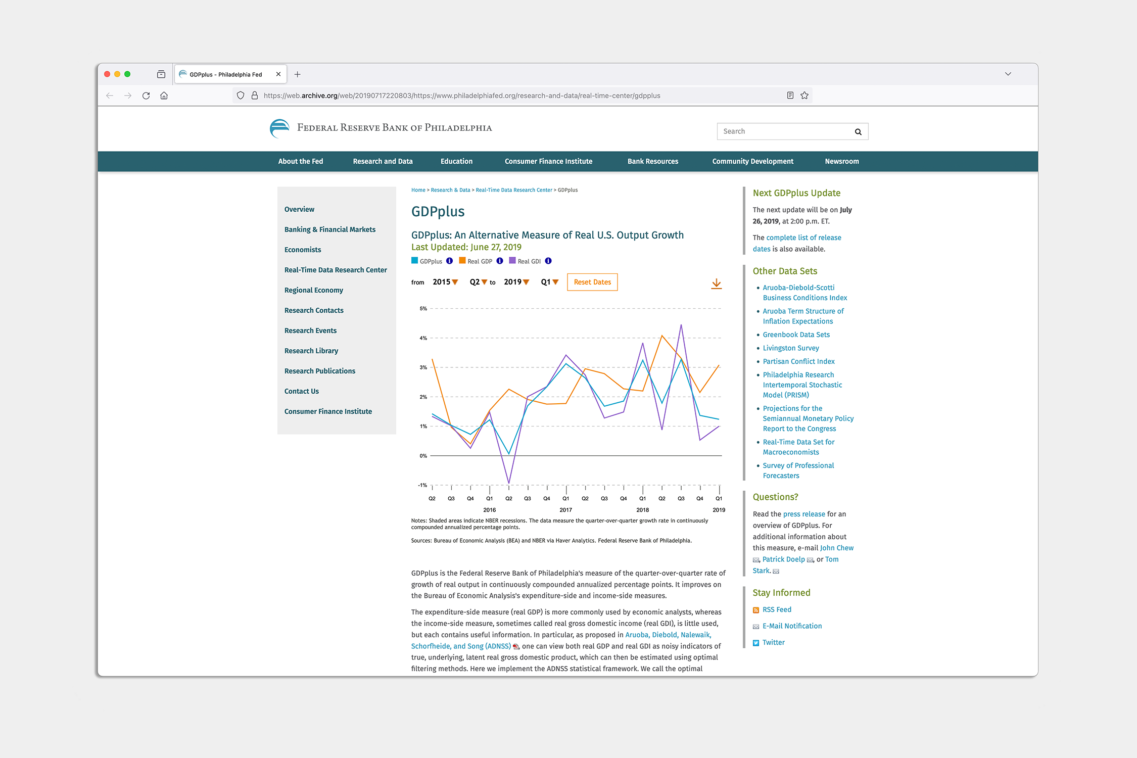
You may be familiar with gross domestic product (GDP), which measures the output of the economy. The Philadelphia Fed’s economic research department synthesises GDP data with gross domestic income (GDI) data, creating an alternative measure of economic output, GDPplus.
Gross domestic product (GDP) measures all the goods and services produced by an economy, but economists measure it in different ways. Research economists at the Philadelphia Fed devised a new method of measurement: a combination of two earlier methods to produce a more accurate estimate called GDPplus.
My team and I designed and developed a data-driven, interactive line chart showing GDPplus and the two main methods of measuring GDP. The new tool not only provided the Bank with one of its first interactive, data-driven web applications, but provided us with the first building block by which my team would construct a suite of data visualisation tools and applications for the Research Department and later the broader Bank website.
The first step in a long journey to update the Philadelphia Fed’s economic research communications.
Our next step led us to the Partisan Conflict Index, built upon the blocks established with GDPplus.