Cities Dashboard
Goal: create a new data-driven, interactive, web-based application, or dashboard, for the launch of Euromonitor International’s then-new Cities coverage for Passport.
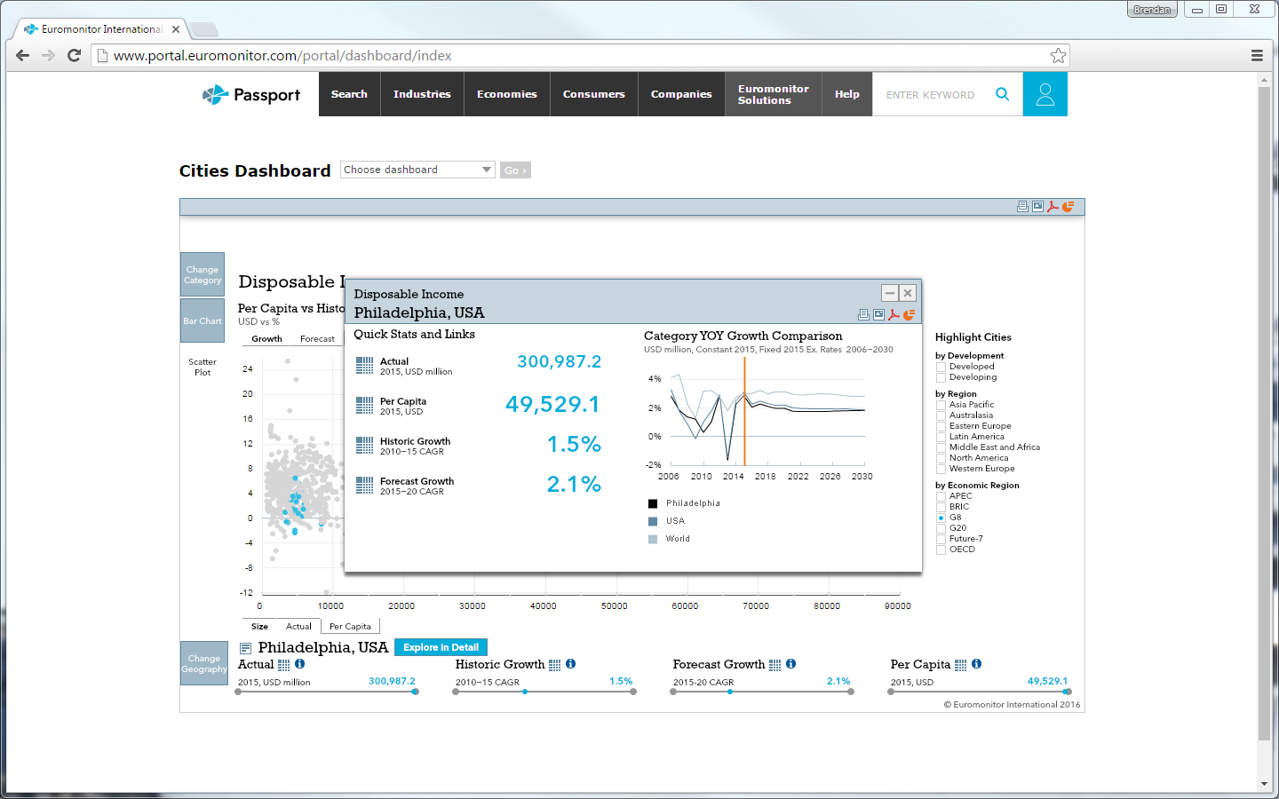
I used the basic framework of my Industry Overview Dashboard to quickly design a new application better suited to a dataset indirectly linked to country-level geographies. The new dashboard, the Cities Dashboard, required different forms of data visualisation and, on the backend, needed to handle significantly more data points than 100+ countries.
Front-end Team
- Product owner
- Content expert
- Designer
- Developer
Skills Applied
- Information design
- UX/UI design
- Data visualisation
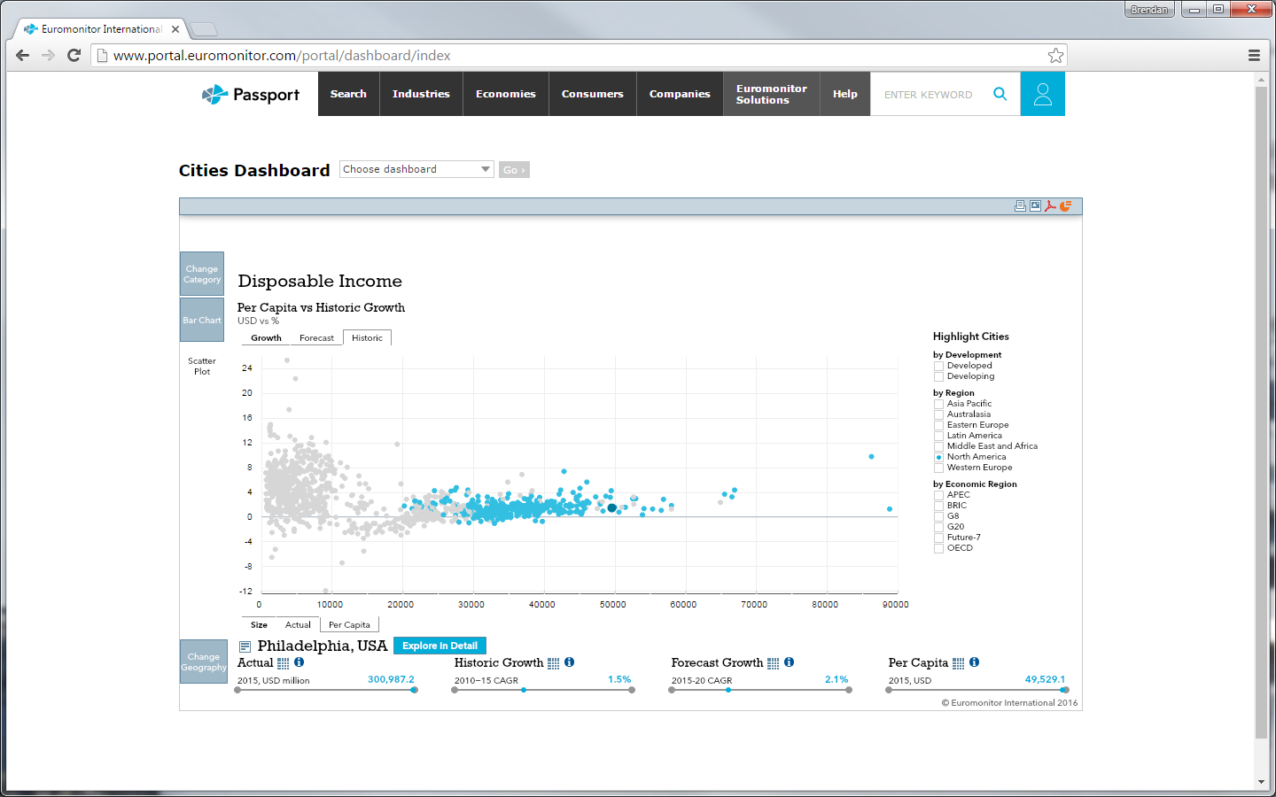
I rejected an initial suggestion to use dots on a map for cities, because our earlier difficulties faced in having users identify countries on map would have been compounded by having users try to identify cities—many of which would overlap—on a map. But by largely keeping the same architecture as the earlier dashboards, we nonetheless were able to quickly design, develop, and launch the Cities Dashboard in time for the launch of its associated data set.
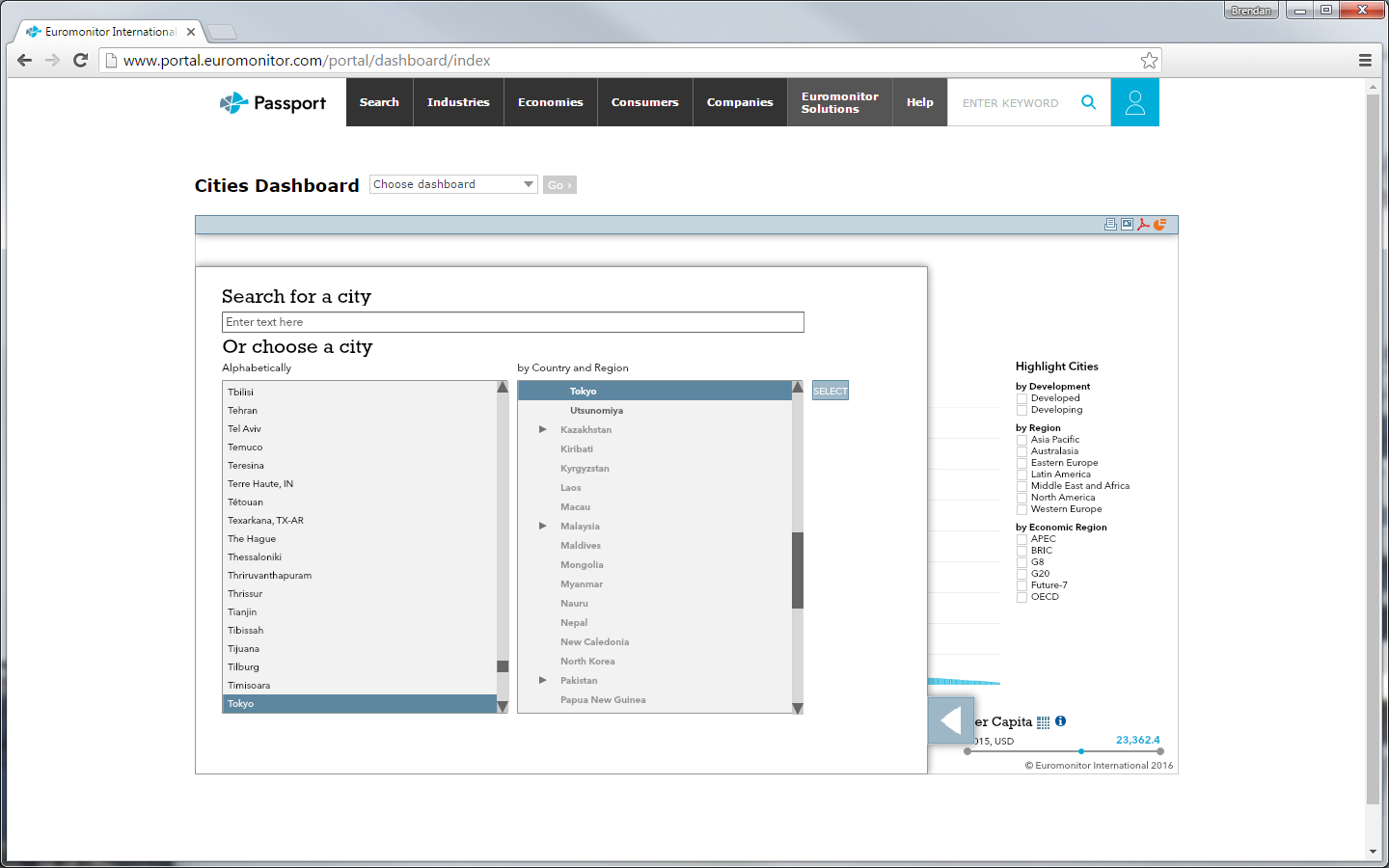
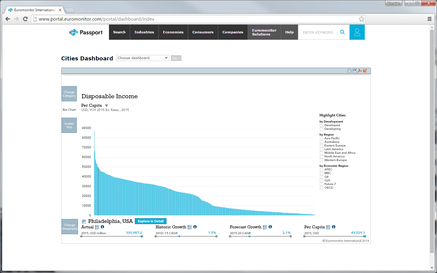
By dropping maps entirely, I gave the bar chart and scatter plot newfound importance. But even then, the confined space of the dashboard display created difficulties—showing 800-odd cities shrank bars to perhaps a pixel’s width. Additionally, selecting cities via our panel menu offered its own challenge as the system listed cities alphabetically without parent countries. I created a dashboard-specific dictionary allowing us to group cities by country.
I also removed the regional aggregates, providing more space for the 800 bars and dots, and allowing users to make better use of the highlight geography feature. I modified the feature’s design, enabling it to stay open so users could cycle through highlighted cities of different regions and organisations.
1
Dashboard
100+
Categories
800+
Cities