COVID-19 Datagraphics
The goal: provide the public of the Federal Reserve’s Third District a daily updated set of datagraphics tracking the COVID-19 pandemic in the region.
Throughout the lockdown, in my own time I created datagraphics tracking the COVID-19 outbreak in Pennsylvania, New Jersey, Delaware, Illinois, and Virginia. When Philadelphia Fed economists began using my work in monetary policy discussions, I offered to create a specific series for the Bank. I pointed to my development of Euromonitor International’s datagraphic product offering as a guide. Later, as the pandemic’s seriousness clarified, I proposed a cross-departmental content hub for the website where the Bank could aggregate COVID-19 content.
Production Team
- Product owner
- Designer
- Developer
- Design intern
- Research assistant
Skills Applied
- Design management
- Editorial design
- Information design
- Product design
- UX/UI design
- Data visualisation
- Social media
My Personal Work
At the beginning of COVID-19, we had little idea of how and where the novel coronavirus was spreading. I started using the data provided by Johns Hopkins University to produce datagraphics about the pandemic and continued for nearly two years.
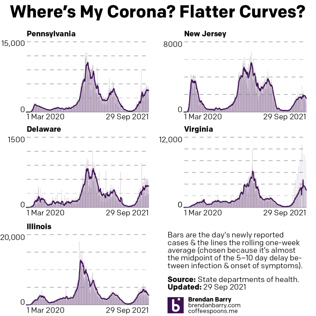
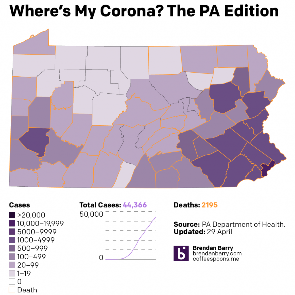
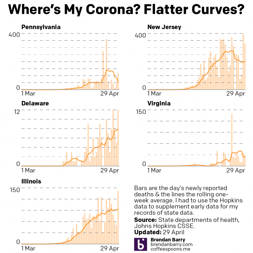
Before the lockdowns began, I tracked the pandemic’s initial spread producing datagraphics for Instagram and Facebook for my family and friends. Once the lockdowns began in earnest, I committed to daily production of datagraphics for what would become Pennsylvania, New Jersey, Delaware, Illinois, and Virginia after requests from friends and family outside Philadelphia.
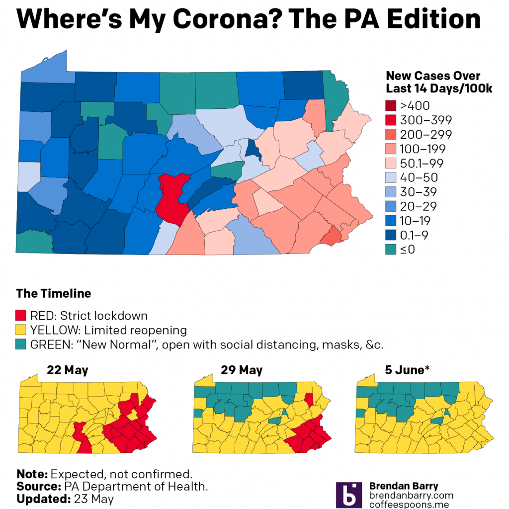
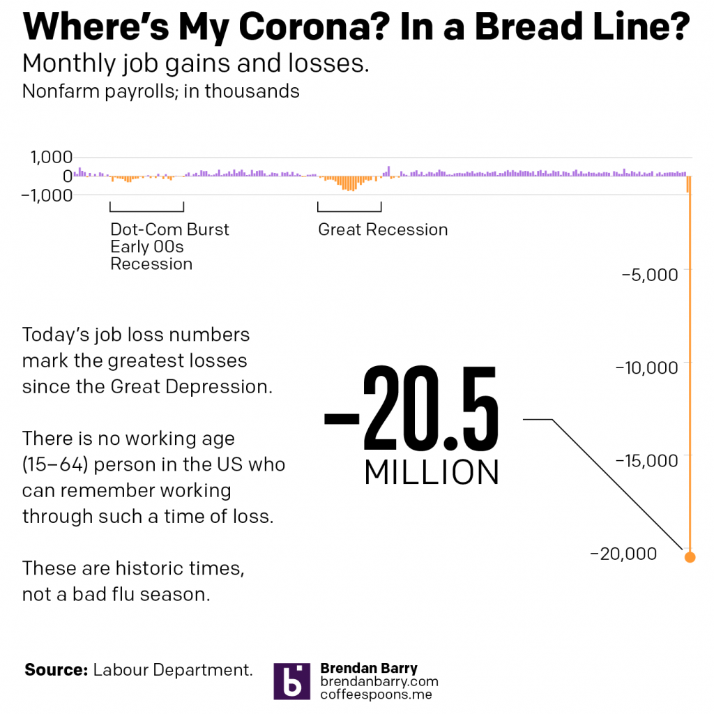
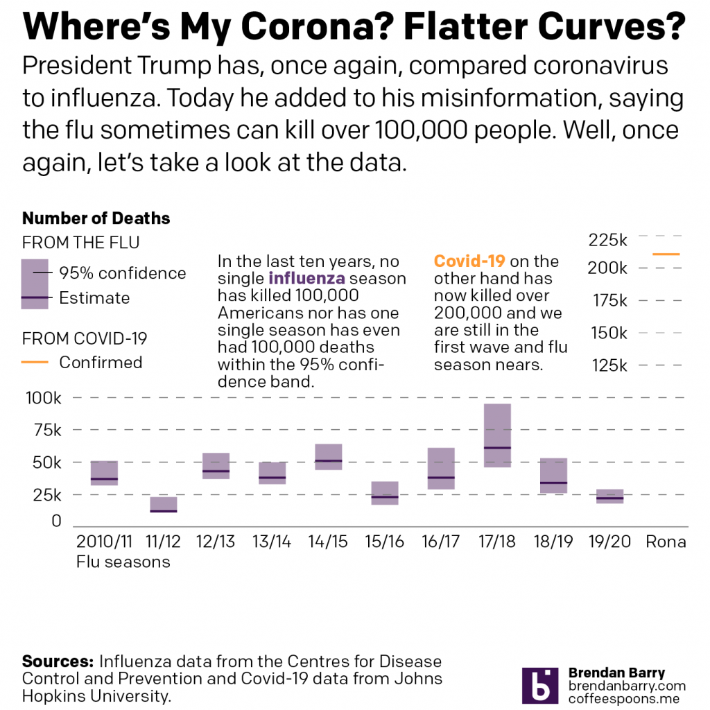
Initially I produced these datagraphics solely for myself after hours, because during lockdown I had plenty of free time. When news or special coverage warranted, I added additional bespoke graphics separate from my regular series. These included maps about reopening conditions in Pennsylvania, comparisons of COVID to the flu, and the economic impacts.
A depressing design piece.
- Produced daily for Instagram and Facebook.
- Summarised weekly for Coffeespoons.
Adapting My Work for the Philadelphia Fed
I learned research economists had incorporated my work into their monetary policy discussions at the Philadelphia Fed. After discussions with leadership, I designed and developed a series covering the Federal Reserve’s Third District my team and I produced daily each workday.
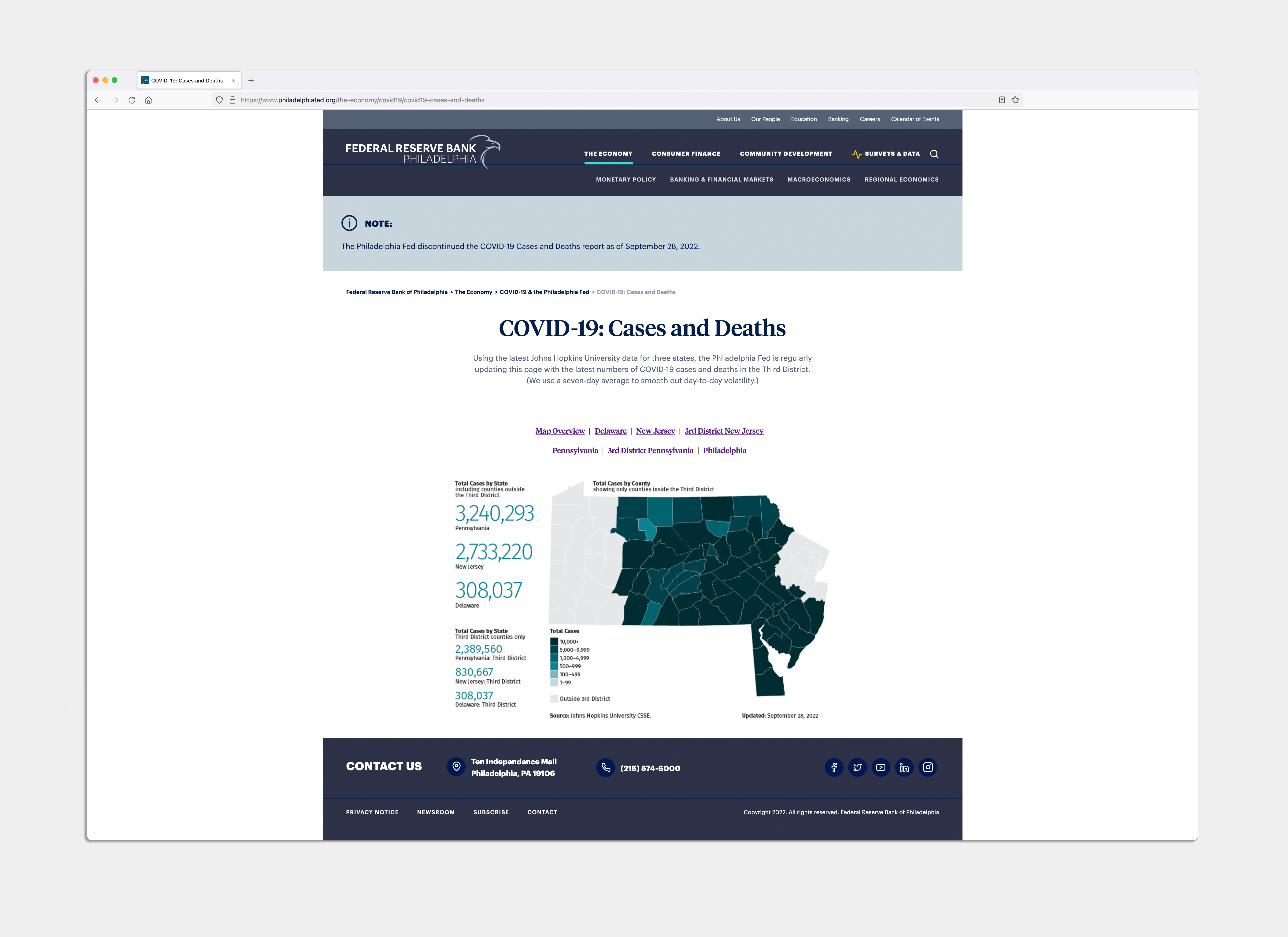
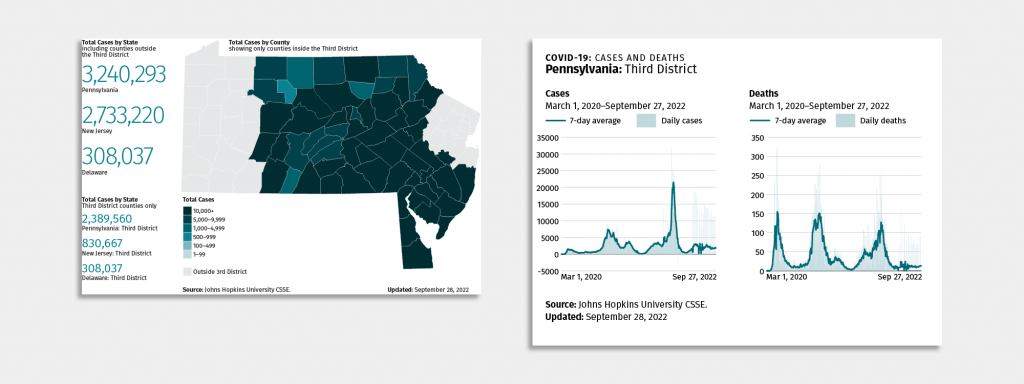
For the Philadelphia Fed, I initially provided a single choropleth map of the tri-state region covered by the Third District, the eastern two-thirds of Pennsylvania, southern New Jersey, and all of Delaware. Following that success, I added a set of five graphics of daily new cases and deaths and seven-day rolling averages of each.
After the Research Department started producing research and analysis I advocated the Bank produce a sitewide COVID-19 content hub, incorporating Research Department data and analysis along with any additional work produced by other Bank departments.
A public service.
- 7 Datagraphics per day
- 5 Updates per week
- 3 Summers of supervising my interns’ production
- 2.5 Years of reporting on illness and death
- 1 Project I hope not to repeat